Responsive layout systems
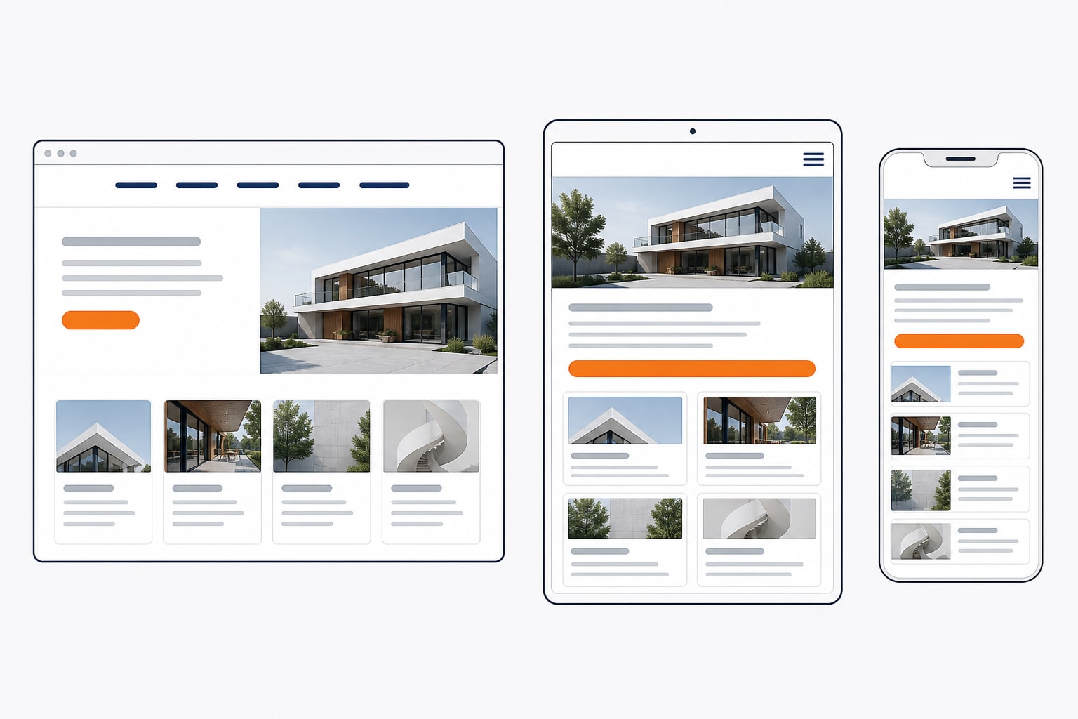
Flexible grids and sections that reflow content without trapping key messages on narrow or wide screens.
GraphicDigits provides responsive website design services that plan how layouts, navigation, typography and components adapt across phone, tablet and desktop—so business sites stay clear and usable beyond a single screen size.
This page owns responsive and mobile-friendly design intent. For broader strategy, page systems and full-site commercial scope, see our complete website design services.
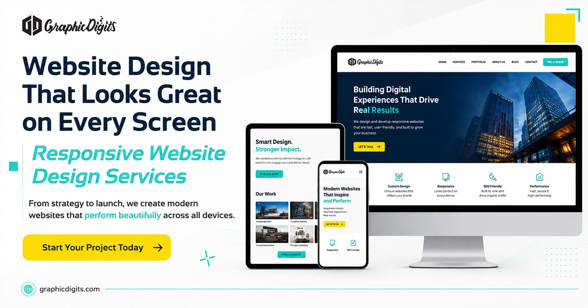
Responsive web design is more than shrinking a desktop mockup. It is the deliberate planning of multi-device website experiences—flexible structure, adaptive UI and usability across common widths.
Flexible grids and sections that reflow content without trapping key messages on narrow or wide screens.
Prioritize essential hierarchy on small screens first, then expand thoughtfully for tablet and desktop.
Menus, sticky bars and secondary links planned so wayfinding stays clear—not just miniaturized.
Readable type sizes, line length and spacing that hold up from phone portrait to large monitors.
Cropping intent, focal points and content density planned so media and copy remain useful on each device class.
Primary actions and form fields placed and sized so taps and fills stay practical at common widths.
“Mobile-friendly” often means a page does not break catastrophically on a phone. Responsive website design goes further: it defines how hierarchy, spacing, navigation and components behave as the viewport changes—including tablet and desktop, not only smartphones.
When you need a wider scope—positioning, full information architecture and overall visual system—pair this work with broader website design support instead of treating responsive layout as a complete site redesign by itself.
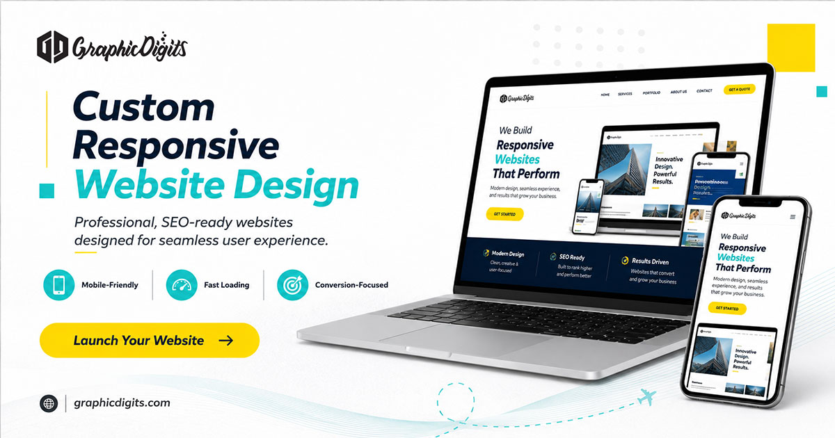
These issues often show up when a site was designed for one device class and later squeezed onto others.
Columns stack poorly, type stays too small and CTAs compete for attention in a long, unclear scroll.
A basic viewport meta tag is not the same as purposeful breakpoint design, flexible components and navigation behavior.
Hover-only menus, tiny targets and overflow patterns create dead ends for tablet and phone users.
Key conversion steps become hard to complete when fields, buttons and trust cues were designed for wide screens only.
Choose the engagement that matches how much of the site must change—not only how small the screen is.
Best when the brand and content are largely set, but multi-device structure, UI and usability need a disciplined update.
Best when information architecture, page types and visual system are also being redefined—not only breakpoints.
Budget framing for early planning is covered separately in our affordable website design guide—this page stays focused on responsive design quality, not price claims.
Clarify audiences, primary journeys and which page types must work hardest on mobile versus desktop.
Define layout rules, component behavior and navigation patterns across agreed widths.
Design key templates, flexible sections and interaction states with revision rounds for clarity.
Review designs against common widths and package annotated specs for implementation teams.
For a wider view of how GraphicDigits collaborates on design projects, see our process.
Browse related visual work in our design portfolio.
Responsive website design, mobile-first UI planning, breakpoint-aware components, usability across common widths and design handoff for implementation.
Guaranteed rankings, Core Web Vitals scores, conversion lifts, custom backend engineering, hosting or server management—those require separate scoping and verification.
For product-style interface systems beyond marketing-site breakpoints, explore mobile UI design. When brand consistency across the site matters first, see branding design.
Share the devices that matter most, priority pages and whether this is a redesign or part of a wider site project.
By submitting, you agree to our Privacy Policy.
Request a quote for responsive website design, or book a call to discuss redesign scope versus a broader website project.