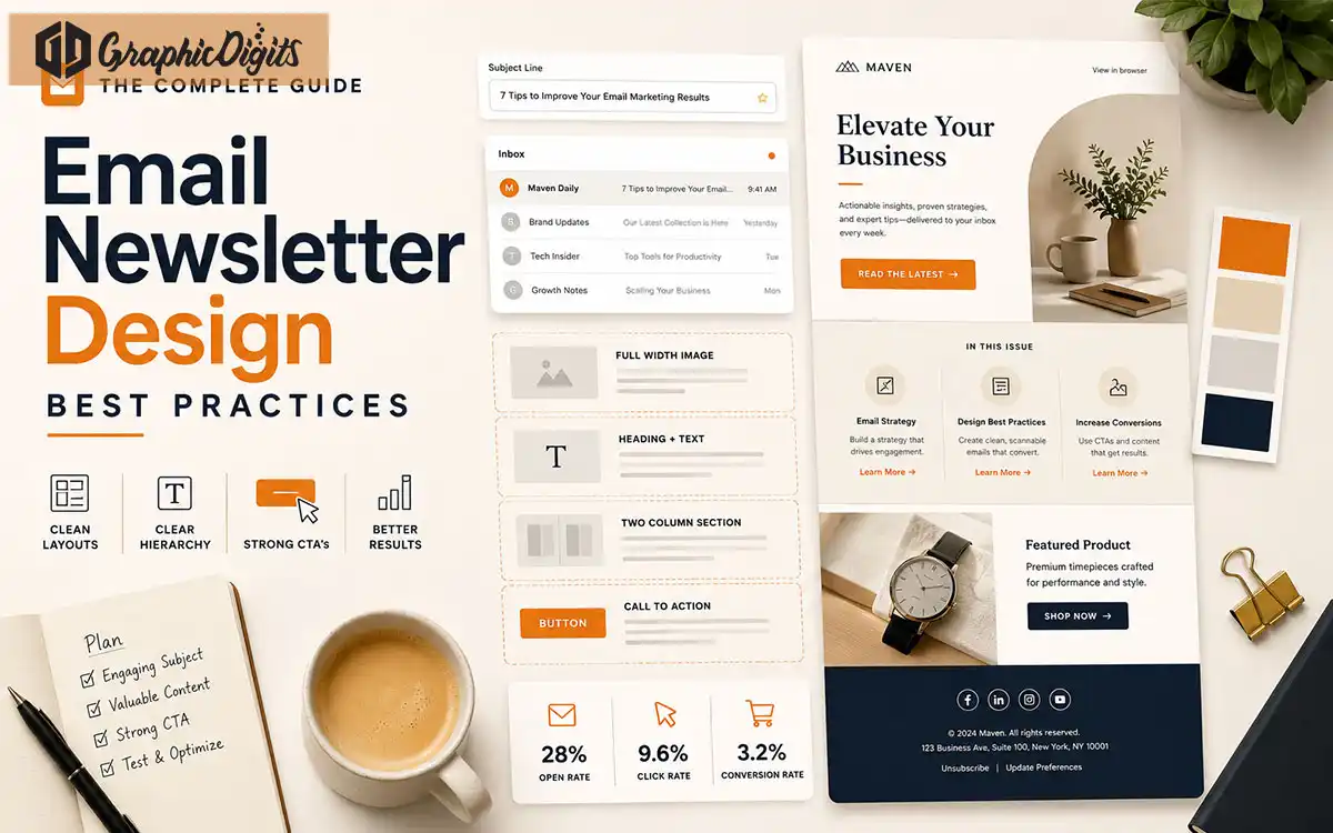
Email newsletter design best practices are easiest to apply as a final review: check hierarchy, spacing, CTA clarity, image use, brand consistency and mobile readability before the design is approved or handed off. This guide focuses on QA and pre-send design checks rather than the full newsletter planning process.
For the full planning, layout and formatting process, see the email newsletter design guide. Reusable systems belong in email template design; broader fundamentals live in email design.
- Review hierarchyConfirm one primary message and CTA before approving the layout.
- Check mobile previewVerify readability, spacing and tap-friendly CTAs at phone width.
- Finish with QAUse a pre-send design checklist before handoff or campaign approval.
Section 01
Why Newsletter Design QA Matters
A polished concept can still fail if hierarchy is unclear, CTAs compete or the phone-width preview hides the next step. Best practices are most useful as review criteria—not a second how-to for building the layout from scratch.
Use this guide after content order and modules are planned. Confirm the design is ready for approval or handoff, then let the client's ESP or build team handle platform implementation.
Section 02
Structure & Hierarchy Checks
Do not rebuild the layout here—verify it. Ask whether the header is recognizable, the primary message is obvious, modules are visually distinct, the CTA is easy to find and the footer stays consistent.
Header recognition
Primary message clarity
Module scannability
CTA prominence
Footer consistency
If modules or reading order still need planning, return to the full email newsletter planning process before more QA polish.
Section 03
CTA Clarity Review
Check whether one primary action stands out. Supporting links may exist, but equal-weight buttons usually hide the next step. Button copy should state a clear outcome and remain visible after the lead section.
Section 04
Mobile Readability QA
Review whether the design remains readable and usable at phone width: type size, spacing, CTA separation, short modules and image scaling. Preview at phone width before approval.
Final responsive behavior across email clients belongs with the implementation or ESP team—this Guide covers visual design QA, not HTML engineering or cross-client test services.
Section 05
Brand Consistency Checks
Confirm logo placement, brand colors, button style, image style, section spacing and footer branding feel consistent from top to bottom. Inconsistent treatment is a review failure even when individual modules look fine.
Logo placement
Brand colors
Button style
Image style
Section spacing
Footer branding
Section 06
Image & Text Balance Checks
Check that images support the message without carrying all essential text. Confirm alt text and live copy remain useful if images are blocked. Heavy or unclear visuals are a QA flag—not a reason to invent deliverability claims.
Before Handoff
Pre-Send Newsletter Design Checklist
Treat each campaign as a short design quality-assurance pass. Walk this newsletter design checklist before you approve artwork or hand it off:
Confirm the primary task
Every issue should have one main action, such as reading an article, viewing a product, registering, or replying.
Check the live preview
Review the subject line, preheader, sender name, CTA and first screen together before approving the design.
Keep essential meaning in text
Use descriptive alt text and live text for important messages so the email remains useful when images are blocked.
Review representative previews
Check phone-width and desktop previews before handoff, especially after template or module changes. Final client or ESP testing stays with the implementation team.
Confirm hierarchy and spacing
Primary message and CTA should remain easy to find; modules should feel distinct without crowding.
Confirm brand consistency
Logo, colors, buttons and imagery should feel like the same brand from header to footer.
Confirm image/text balance
Essential information should not live only inside images; optimized visuals should support readable copy.
Confirm ESP or template readiness
Note final width, modules and assets for the client's ESP or build process—GraphicDigits design QA does not replace platform setup.
Save approved modules and notes with brand assets so future reviews stay consistent.
Confirm final ESP or template requirements with the client's implementation team.
Avoid These
Common Newsletter Design Mistakes
These review failures hurt clarity, trust and clickability before a send ever goes out.
Too many competing CTAs
Equal-weight buttons hide the primary next step and reduce clarity.
Dense text blocks
Long unsectioned copy is hard to scan, especially on phones.
Weak hierarchy
When every module competes equally, readers miss the main message.
Inconsistent brand treatment
Mixed colors, logos and button styles make the send harder to trust.
Essential text only in images
If images are blocked, the core offer and CTA should still be readable.
Poor contrast or tiny type
Low contrast and undersized text hurt mobile readability.
Mobile crowding
Desktop-only layouts with tight grids often fail at phone width.
Skipping pre-send review
Approving a pretty layout without checklist review misses preview and CTA issues.
Treating desktop as enough
Most opens happen on phones—phone-width preview is part of design QA.
Unclear handoff responsibility
Design approval and ESP/build testing should be explicitly separated.
Next Step
When Professional Design Help Fits
Need professional newsletter design after reviewing your brief? Explore newsletter design services. GraphicDigits scopes branded layouts and artwork—not ESP setup, list management, sending or deliverability.