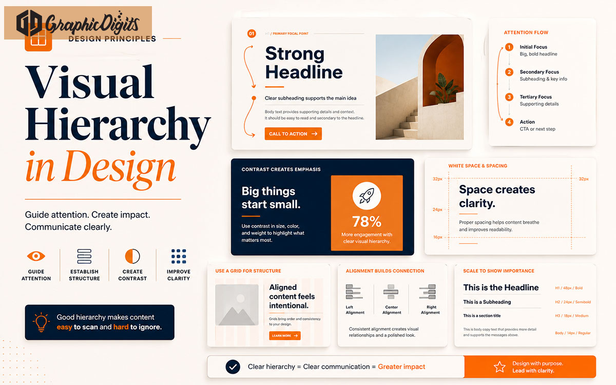
Visual hierarchy is one of the most important principles in effective design. It controls what people notice first, what they read next, and how easily they understand the message.
Without visual hierarchy, a design can feel confusing even if the content is good. Everything may look equally important, which makes it harder for viewers to know where to focus.
This guide explains how visual hierarchy works and how businesses can use it in websites, social media graphics, brochures, presentations, ads, and marketing materials.
- Guide attentionUse size, contrast, and layout so viewers know what to read first.
- Improve clarityStrong hierarchy makes websites, ads, and print easier to scan.
- Support actionClear focal points and CTAs help people take the next step faster.
Section 01
What Is Visual Hierarchy?
Visual hierarchy is the arrangement of design elements in a way that shows their order of importance.
It uses size, color, contrast, spacing, typography, alignment, and layout to guide the viewer’s eye through the design.
A strong hierarchy helps people understand the main message quickly and take the next step with less confusion.
Section 02
Why Visual Hierarchy Matters
Good visual hierarchy improves clarity. It helps your audience identify the headline, supporting message, key benefits, CTA, and important details.
For business design, hierarchy can directly affect engagement and conversions. A landing page, flyer, brochure, social post, or presentation slide should guide viewers toward the most important action.
When hierarchy is weak, designs feel cluttered, hard to scan, and less persuasive.
Section 03
Size and Scale
Larger elements usually attract attention first. Headlines, hero messages, key visuals, and CTA sections often use size to create priority.
Use scale carefully. If everything is large, nothing feels important.
Large headline
The biggest text should carry the main message and attract attention first.
Medium supporting text
Subheadings and short paragraphs explain the headline without competing with it.
Small detail text
Captions, labels, and fine print stay readable but visually secondary.
Clear CTA emphasis
Buttons and action areas should stand out through size, color, or placement.
Section 04
Contrast and Color
Contrast helps important elements stand out. This can be created through dark and light colors, bold and regular text, warm and cool colors, or filled and outlined buttons.
Color can also guide attention. For example, an orange CTA button on a neutral background can help users identify the next action faster.
Use contrast to improve readability, not just decoration. See how color shapes perception in our color psychology guide.
Section 05
Typography Hierarchy
Typography hierarchy defines how headings, subheadings, body text, labels, and buttons should appear.
A strong typography system makes content easier to scan. It also helps your design feel professional and consistent.
Section 06
Spacing and White Space
White space gives content room to breathe. It separates sections, improves readability, and makes important elements feel more premium.
Crowded layouts can make even professional content feel cheap or confusing.
Good spacing helps users move through the design naturally.
Section 07
Alignment and Layout
Alignment creates order. When elements line up correctly, the design feels cleaner and easier to understand.
Layout grids help organize content into sections, columns, cards, and visual blocks.
Strong alignment is especially important for websites, brochures, pitch decks, and social media templates. Learn more in our website design best practices guide.
Section 08
Repetition and Consistency
Repeating design patterns helps users understand how the layout works. Consistent buttons, cards, headings, icons, and spacing make the design feel more polished.
Repetition also supports brand recognition.
When every section uses a different style, the design becomes harder to follow.
Section 09
Visual Flow and Focal Points
Visual flow is the path your viewer’s eye follows through the design. A good layout leads attention from headline to message to proof to CTA.
Focal points are the most important areas of the design. Use size, contrast, imagery, and spacing to make them clear.
Capture attention
Use a strong headline, hero visual, or focal point so viewers know where to look first.
Explain the message
Support the headline with clear subtext, benefits, and organized content blocks.
Build trust
Add proof such as testimonials, logos, stats, or visuals that reinforce credibility.
Guide action
Place a visible CTA that tells users what to do next without searching the layout.
Landing pages benefit especially from this flow. Explore our landing page design guide for conversion-focused layouts.
Avoid These
Common Visual Hierarchy Mistakes
These issues weaken clarity and make even good content harder to understand.
Making everything the same size
When all elements compete equally, nothing feels important and the layout is hard to scan.
Using too many fonts
Multiple typefaces create noise and weaken the relationship between headings and body text.
Weak contrast
Low contrast between text and backgrounds reduces readability and hides key actions.
Crowded layouts
Too much content in one view overwhelms users and makes hierarchy impossible to follow.
Unclear CTA placement
If the next step is buried or styled like body text, fewer people will convert.
Poor spacing
Tight spacing blurs section boundaries and makes professional content feel cluttered.
Too many competing focal points
Multiple bold elements fight for attention and confuse the viewer’s path.
Inconsistent alignment
Misaligned blocks feel messy and make structured content harder to trust.
Partner With Us
How GraphicDigits Can Help
GraphicDigits creates professional designs that use clear visual hierarchy to improve communication, readability, and user action.
We design websites, landing pages, social media graphics, brochures, presentations, infographics, and marketing visuals that guide attention with purpose.
Whether your design needs better structure, stronger CTAs, cleaner layouts, or improved readability, our team can help create visuals that look professional and communicate clearly through graphic design services, website design, social media graphics, brochure design, presentation design, and infographic design. Get a quote to discuss your project.
Need Designs That Communicate Clearly?
Get professional design support for layouts, websites, social media graphics, brochures, and presentations that guide attention and drive action.