Email newsletter design starts with hierarchy: one clear purpose, a recognizable header, scannable content sections and a primary CTA that remains easy to find on smaller screens. Before styling individual modules, define the message order, content blocks, spacing and brand rules so the newsletter is easy to scan and consistent from section to section.
This guide is the informational how-to for planning email newsletter layouts—not a hiring page. If the design brief is already defined and you need professional branded newsletter artwork, explore newsletter design services. GraphicDigits designs layouts and artwork; ESP setup, list management and sending stay separate unless clearly scoped.
How to design an email newsletter
Use this practical sequence before you polish colors or icons. It covers how to design a newsletter edition that stays readable and clickable:
- Define one purpose for the send
- Identify the audience and what they already know
- Establish content hierarchy—primary message first
- Plan the header and key body modules
- Decide CTA priority (one primary action)
- Apply brand styles consistently across modules
- Review spacing and scannability
- Check mobile readability at phone width
- Prepare final assets and handoff notes for build or ESP paste-up
For broader email design fundamentals beyond newsletters, see that companion guide. Teams that need reusable structures should use email template design.
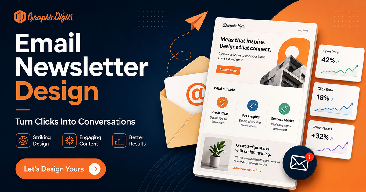
Plan content hierarchy first
Not every module should compete equally. Lock a primary message, then secondary sections, CTA priority, supporting details and footer information. Two equal “hero” offers usually bury both.
- Primary: one job for this edition (announce, educate, promote or nurture)
- Secondary: stories that support—not duplicate—the lead
- CTA: one primary action; optional secondary text links only
- Footer: logo, utility links, unsubscribe and legal notes in a predictable place
Email newsletter layout structure
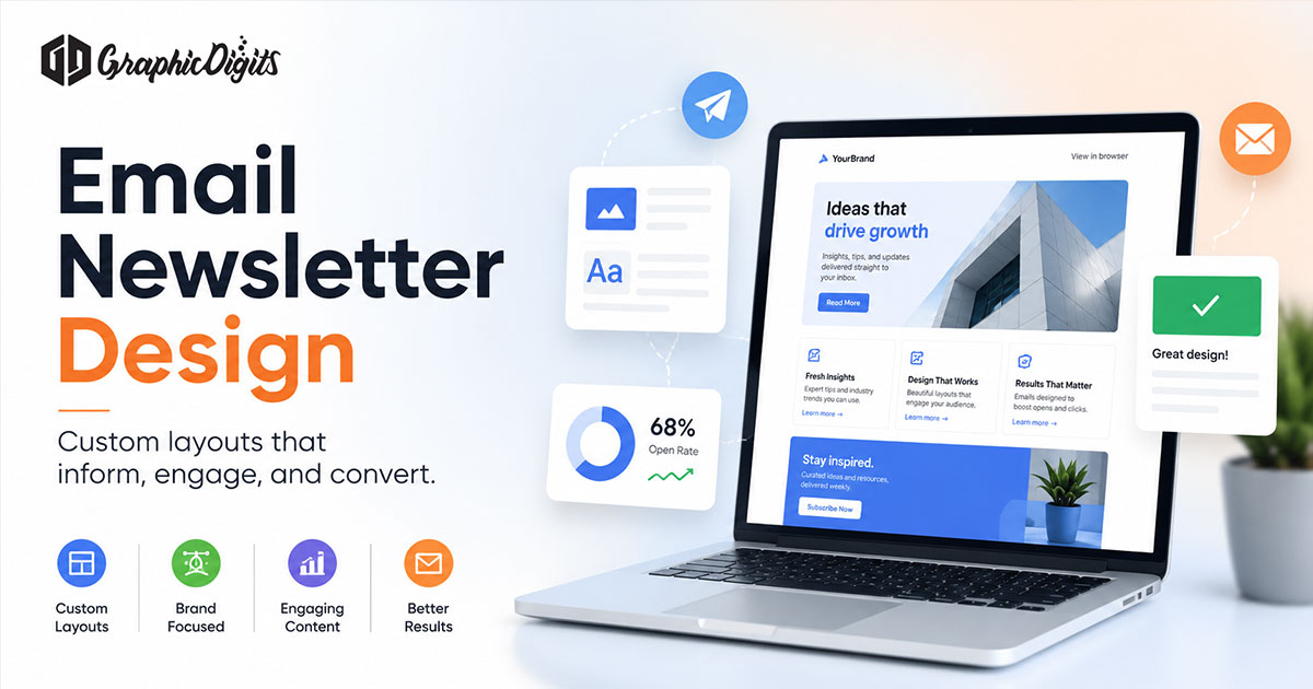
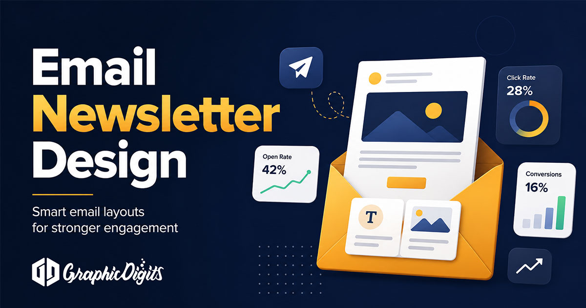
A clear layout usually includes a recognizable header, a lead or hero content block, supporting body modules in reading order, spaced section headings, CTA placement where the eye lands after the first block, and a consistent footer. Use whitespace or light dividers between stories—not competing banners.
- Header: logo and optional navigation or issue label
- Lead: short headline plus supporting line—not a dense paragraph
- Body modules: stacked sections with clear headings
- CTA area: visible button or link with verb + outcome
- Footer: utility and compliance content that stays familiar across sends
How to format an email newsletter
Formatting is about predictable content order and readable rhythm—not inventing a new page for every send. Prefer short sections, clear headings, readable paragraph lengths, consistent modules, CTA separation from body copy, spacing rhythm and a recognizable footer.
- Keep paragraphs short enough to scan on a phone
- Use the same heading style for each module
- Separate the primary CTA from dense body text
- Repeat utility/footer patterns so readers know where to look
Mobile readability
Most opens happen on phones. Favor single-column behavior where appropriate, readable text size, tap-friendly CTA separation, short modules, clear hierarchy and images that scale without carrying the entire message. Preview at phone width before you approve the layout.
This is visual-design guidance. It does not mean GraphicDigits performs responsive HTML development, cross-client engineering or email-client QA as a default service.
Width and size—confirm with your platform
Email newsletter width and module dimensions depend on the email platform, template system and device or client context. There is no single universal pixel size. Design within the chosen template or container, preview at phone width, confirm final width with the ESP or template and avoid fixed assumptions.
Newsletter branding inside the inbox
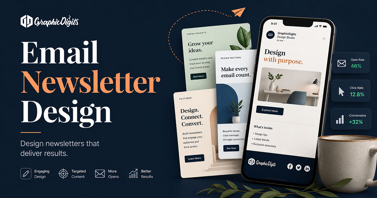
In-email branding keeps the send recognizable: consistent logo usage, typography, brand color on buttons and accents, imagery style and CTA treatment that matches other modules. Prefer strong contrast and web-safe fallbacks—email clients are limited. This is newsletter-level brand consistency, not a substitute for a full brand identity program.
Make CTAs clear and clickable
- Button copy: verb + outcome (Register now, Download the guide)
- Enough space between stacked links on mobile
- Avoid wrapping the entire email in one ambiguous link
- Secondary links can sit in text; do not compete with the main button
Before handoff—and where QA lives
Confirm section order matches the locked goal, the primary CTA is visible on a phone-width preview, images have alt text, and links are labeled. When you need a dedicated final review checklist, use the email newsletter design best practices guide. That guide owns best-practices and QA; this page stays on how-to planning and layout.
Client testing and list hygiene matter for delivery—but those steps sit with your ESP or marketing ops unless scoped separately. Design work ends when artwork and layout notes are ready for build or handoff.
When you need professional newsletter artwork
Need professional newsletter design after planning the layout? Explore newsletter design services. GraphicDigits scopes design files—not campaign sending, deliverability or list management.
Frequently asked questions about email newsletter design
What makes an email newsletter easy to scan?
One clear purpose, a recognizable header, short sections with clear headings, predictable module order, enough spacing, and a primary CTA that does not compete equally with every supporting block. Readers should find the next step without hunting.
How should an email newsletter layout be structured?
Plan a header, lead story or hero message, supporting body modules in priority order, a clear CTA area, and a consistent footer for utility links and legal notes. Keep hierarchy honest—not every module should compete equally.
How should a newsletter be formatted for mobile readability?
Favor scannable single-column behavior where appropriate, readable text, short modules, clear spacing, tap-friendly CTA separation, and images that scale without burying the message. Preview at phone width before handoff.
Is there one standard email newsletter size?
No. Email newsletter width and module dimensions depend on the email platform, template system and device or client context. Design within the chosen template container, preview at phone width, and confirm final width with the ESP or template—avoid fixed universal assumptions.
Does GraphicDigits design the newsletter or manage the email campaign?
GraphicDigits designs newsletter layouts and artwork. ESP setup, list management, sending, deliverability and campaign operations stay with your team unless clearly scoped elsewhere. After planning, see newsletter design services for professional branded artwork.