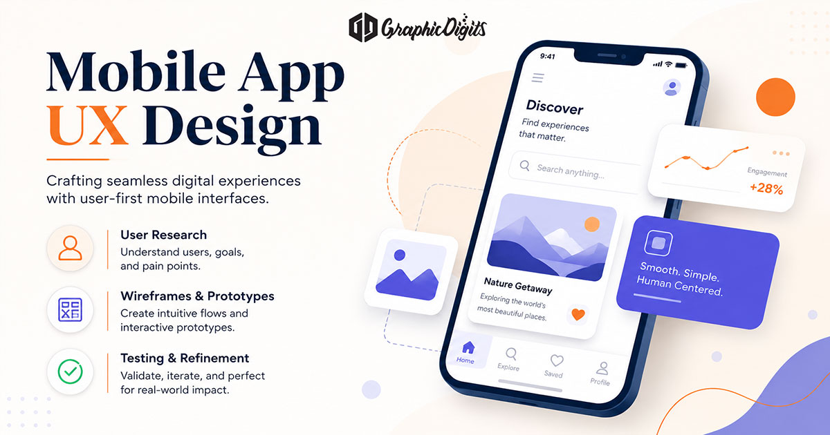
Good interface design makes the next step obvious. People can see what matters, navigate without guessing, recognize interactive controls and get clear feedback when something succeeds or fails. Hierarchy, consistency, readable typography, contrast, spacing and accessible interactions matter more than visual novelty.
The best interfaces tend to feel quiet: predictable controls, clear navigation and states that explain themselves. This guide covers interface design principles, practical patterns and a review checklist—not a ranked list of apps, websites or awards. When you need production screens, use UI design. Flow and research questions sit closer to UX design. Hiring and partner evaluation belong on UI UX design agency; role briefing belongs on user interface designer.
What makes a good interface
A good interface does not call attention to itself. Users can find primary actions, predict what a control does and recover when something goes wrong. Visual polish helps, but only after hierarchy, navigation and feedback are solid.
In practice, good interface design usually shows these traits:
- Clear hierarchy so the eye lands on the main job first
- Intuitive navigation that shows where you are and how to move next
- Consistent patterns so learning carries across screens
- Visible interaction states (hover, focus, pressed, disabled, loading)
- Useful system feedback for success, progress and errors
- Readable typography, sufficient contrast and spacing that reduces clutter
- Accessible interactions: focus, touch targets and labels that work without color alone
- Responsive behavior that stays usable on phone and desktop viewports
Core patterns that make UI clear
- Clarity — One primary job per screen when possible. Secondary actions stay visually quieter.
- Hierarchy — Size, weight and contrast guide the eye before decoration does.
- Navigation — Labels match destinations; current location is obvious; deep paths stay recoverable.
- Consistency — Same components behave the same way across the product.
- Typography & spacing — Type scale and whitespace create a scan path instead of a wall of equal-weight text.
- Color & contrast — Color supports meaning; text and icons remain readable without relying on hue alone.
- Buttons & forms — Interactive elements look interactive; required fields and errors sit next to the control that needs attention.
- Feedback — Every important action gets a visible result or progress cue.
- Forgiveness — Errors explain the fix; destructive actions ask for confirmation.
- Responsive layout — Critical actions and content remain reachable on narrow mobile screens and denser desktop/web layouts.
- Accessibility — Contrast, focus, touch targets and clear labels support real users—not only ideal demos.
These are review criteria, not a style trend. A dashboard and a consumer app can look different and still pass the same clarity tests.
Watch for common interface mistakes that break those criteria:
- Unclear hierarchy where everything competes for attention
- Inconsistent controls that force users to relearn each screen
- Weak contrast and crowded layouts that slow scanning
- Hidden system feedback—no loading, success or error cues
- Unclear button states or forms without inline guidance
- Inconsistent spacing that makes groups hard to parse
- Confusing navigation or ignoring smaller screens
- Inaccessible interactions that depend on color or tiny targets alone
Examples of strong interface choices
Use these as pattern examples—not as a product ranking:
- Checkout or signup — Progress shown, required fields labeled, errors next to the field that failed.
- Settings or account — Grouped by task, with search or clear sections when the list grows long.
- Empty states — Explain what belongs here and the next useful action—not a blank void.
- Mobile navigation — Thumb-reachable primary paths; deep links labeled so users know where they are.
- Desktop/web layouts — Wider space used for structure and density without scattering primary actions far from content.
Mobile-specific process notes live in mobile app UX design. Role split details sit on UX designer vs UI designer.
Interface design checklist
Run this pass before you call a screen “done”:
- Can a new user name the screen’s purpose in one sentence?
- Is hierarchy clear—primary content and CTA obvious without hunting?
- Is navigation labeled so users know where they are and how to go back?
- Do spacing and type create readable groups instead of a dense block?
- Do buttons and form fields look interactive, with clear default and disabled states?
- Is the primary CTA visible without scrolling on a typical phone viewport?
- Does the layout still work when content expands on a desktop/web width?
- Are loading, empty and error states designed for the critical path?
- Would contrast and focus still work without color alone?
- Do labels avoid jargon that only the product team understands?
- If a user taps the wrong thing, can they undo or go back cleanly?
- Are patterns consistent with neighboring screens?
Failures here are design problems—not reasons to invent awards or chase competitor lookalikes.
Where this guide stops
Principles and checklists help teams align on interface quality. They do not replace a scoped design engagement, usability testing on your flows or engineering handoff. GraphicDigits designs interface files and visual systems—not coded builds, app-store submission or unlimited revision rounds.
If your next step is hiring screens and components, open UI design or request a quote with a locked screen list and brand constraints. Keep agency evaluation and UI role briefing on their own articles so each page stays useful.
Frequently asked questions about good interface design
What makes good interface design?
Clear hierarchy, intuitive navigation, consistent patterns, visible interaction states, useful feedback, readable type, sufficient contrast, accessible controls and predictable behavior across screen sizes. Good interface design helps people finish tasks without hunting.
How is UI design different from UX design?
UI design focuses on screens, components, visual hierarchy and interaction cues. UX design focuses on flows, information architecture and whether the journey makes sense. This article covers interface quality; UX process lives closer to UX design and related UX guides.
What should I check before calling an interface “good”?
Can users name the screen’s purpose, find the primary action, predict what happens next, recover from errors and complete key tasks on a typical phone and desktop viewport? Use the checklist in this article as a review pass.
Does accessibility belong in interface design?
Yes—at the design layer. Contrast, focus order, touch targets, readable type and clear labels are interface decisions. Formal certification, legal review and engineering implementation stay with your team or specialists.
When should we hire UI design instead of reading more?
When flows are mostly locked and you need screen layouts, components and visual systems. Open UI design and request a quote with a clear screen list. Revisions are scoped—not unlimited.